How to Create Powerful PowerPoint Charts 2026

How to Create Powerful PowerPoint Charts 2026
A professional presentation is not just putting text and images into slides. The way information is organized and presented is important in making a presentation clear, engaging and easy to understand. MS PowerPoint provides a range of powerful tools that help users to present information in a more visual and organized way.
MS PowerPoint How to Create Powerful PowerPoint Charts 2026 Students, teachers, professionals and business users can learn these features to make better presentations with MS PowerPoint and to communicate their ideas more effectively.
Also Know about MS Powerpoint features https://www.examwithai.com/ms-powerpoint-ultimate-features-in-2026/
What Are the Tables in MS PowerPoint?
A table is a way of arranging information in rows and columns. Tables are helpful for organizing, comparing or presenting information in an easily understood format.
For example, a student can use a table to represent subject-wise marks, while a business professional can use one to compare product prices, sales figures, or monthly performance.
How to Insert a Table in PowerPoint
Creating a table in PowerPoint is simple:
- Open your presentation and select a slide.
- Go to the Insert tab.
- Click Table.
- Select the required number of rows and columns.
- Enter your information into the table.
- Use the Table Design options to improve its appearance.
PowerPoint provides different table styles, borders, shading, alignment, and formatting options. These features allow you to create tables that match the overall design of your presentation.
Benefits of Using MS PowerPoint Tables
Tables can help you organize and compare information. Some of the key benefits are:
- Presenting information in a clear structured way
- Straight up comparing multiple items
- Shortening long paragraphs
- Better organization of slides
- Making important info easier to find
- Designing a professional presentation layout
- But it is not recommended to put too much information in a single table. A simple, well-spaced table is usually better than a crowded one.
Using Charts to Present Data
The presentation contains numerical information, simply displaying numbers may not always be the best approach. How to Create Powerful PowerPoint Charts 2026 Using Charts to Present Data can convert numerical data into visual information, Using Charts to Present Data making comparisons and trends easier to understand.
Charts are commonly used in business presentations, academic projects, reports, marketing presentations, and financial discussions.
Common Types of PowerPoint Charts
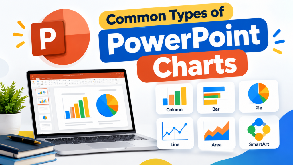
Common Types of Charts PowerPoint provides several chart types, each designed for a specific purpose.
- Column Chart: Useful for comparing values between different categories, such as monthly sales or student marks.
- Bar Chart: Displays data horizontally and works well when category names are longer.
- Line Chart: Useful for showing changes or trends over a period of time.
- Pie Chart: Best suited for showing percentages or parts of a whole.
- Area Chart: Useful for showing trends while emphasizing the overall quantity represented by the data.
- Doughnut Chart: Similar to a pie chart and can be used to present proportional data in an alternative visual form
How to Insert a Chart in PowerPoint
To add a chart to your presentation:
- Select the required slide.
- Open Insert tab.
- Click the Chart.
- Choose the required chart type.
- Select a chart style and click OK.
- Enter or edit your data in the spreadsheet window.
- Close the spreadsheet to update the chart.
PowerPoint automatically creates the chart based on the data you enter.
Why Charts Make Better Presentations
Why Charts Make Better Presentations ; A Charts allow audiences to understand data without reading long lists of numbers. They can help you:
- Show comparisons clearly
- Explain trends
- Highlight important figures
- Present statistics visually
- Make data easier to remember
- Improve the overall visual quality of a presentation
- The key is to select the right chart for the information. For example, a Line Chart is generally more suitable for showing a trend, while a Pie Chart works better for showing simple proportions.
Understanding SmartArt in MS PowerPoint
The SmartArt is a visual graphics feature in PowerPoint that helps users communicate information through diagrams and structured layouts.
Instead of explaining a process using multiple paragraphs, SmartArt can present the same information using connected shapes and visual elements.
For example, a project workflow can be represented as:
Planning → Development → Testing → Launch
This type of visual representation allows the audience to understand the sequence quickly.
Types of SmartArt Graphics
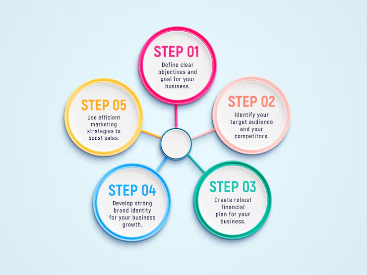
PowerPoint offers several SmartArt categories.
- List: Useful for presenting related points or information.
- Process: Ideal for showing steps, stages, or workflows.
- Cycle: Useful for processes that repeat continuously.
- Hierarchy: Helpful for organizational structures and reporting relationships.
- Relationship: Used to show connections between different ideas or elements.
- Matrix: Useful for presenting relationships between groups or categories.
- Pyramid: Suitable for showing levels, stages, or hierarchical information.
How to Add SmartArt
You can add SmartArt to a slide using these steps:
- Select the slide where you want to add the graphic.
- Go to the Insert tab.
- Select SmartArt.
- Choose a suitable category.
- Select the desired layout.
- Click OK.
- Enter your information into the text pane.
- Customize the colors, layout, and SmartArt style.
How to Add SmartArt can also be resized and modified to match the design of your presentation.
Tables vs Charts vs SmartArt
Although these three tools are all used to improve presentations, each one has a different purpose.
| PowerPoint Tool | Best For | Example |
| Table | Organizing and comparing information | Product price comparison |
| Chart | Showing numerical data and trends | Monthly sales |
| SmartArt | Explaining ideas and processes | Project workflow |
How to Add SmartArt Choosing the right visual tool can make a significant difference in how effectively your audience understands the information.
Tips to Create Better Presentations with MS PowerPoint
Using Tables, Charts, and SmartArt effectively requires more than simply inserting them into a slide. Consider the following tips:
Keep the Design Simple
Avoid unnecessary effects, excessive colors, and complicated layouts. A clean design makes information easier to understand.
Choose the Right Visual
Use a Table for structured data, a Chart for numerical information, and SmartArt for processes, relationships, and ideas.
Avoid Information Overload
Do not place too much information on one slide. Break complex information into multiple slides when necessary.
Maintain Consistency
Use consistent fonts, spacing, alignment, and design elements throughout your presentation.
Highlight Important Information
Use appropriate formatting to emphasize key figures, steps, or categories without making the slide visually overwhelming.
Focus on Readability
Make sure text inside tables, charts, and SmartArt is large and clear enough for the audience to read comfortably.
Why These Features Matter
Tables, Charts, and SmartArt can transform a basic slide into a more effective visual communication tool. They allow presenters to reduce unnecessary text and focus the audience’s attention on important information. For students, these features are useful for school projects, assignments, seminars, and academic presentations. Professionals can use them for business reports, meetings, training sessions, marketing presentations, and project updates.
Learning these features is therefore an important part of developing practical PowerPoint skills
Conclusion
MS PowerPoint: Create Better Presentations with Tables, Charts & SmartArt is not just a title—it represents an important approach to effective presentation design. Tables help organize information, Charts make numerical data easier to understand, and SmartArt makes processes and relationships more visual.
When these tools are used with a clean design, relevant content, and proper formatting, presentations become more professional, informative, and engaging.
Whether you are a student preparing an academic project or a professional creating a business presentation, learning how to use these PowerPoint features can help you create better presentations with MS PowerPoint and communicate your ideas with greater clarity.